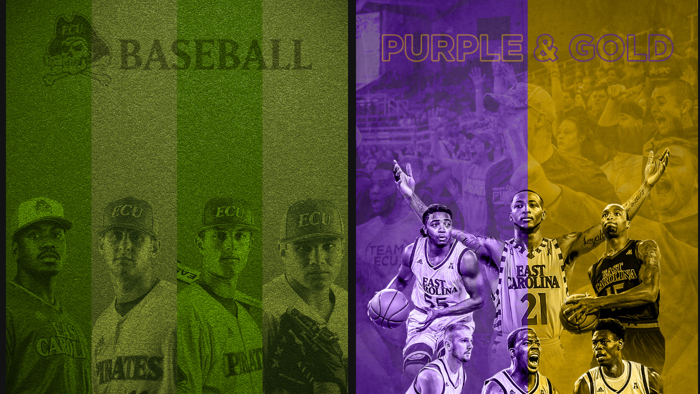
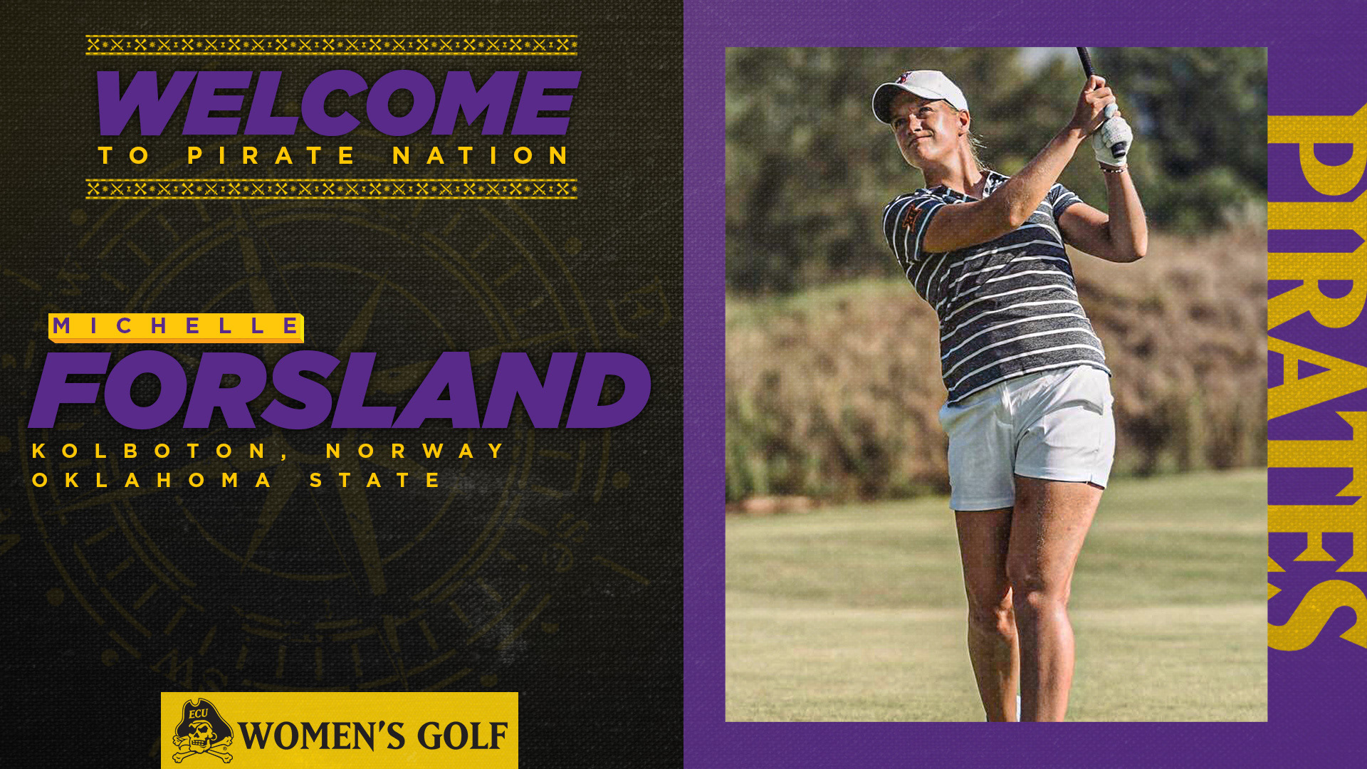
2020-21 BRANDING
The extra time has allowed me to experiment with our look for the 2020-21 school year. With our uniforms incorporating more black in recent years, and the natural tie in with the color of flags Pirates would fly on their ships, I decided to use a black base for our overall branding this year.
Along with the darker theme, I used a grungy canvas and heavily edited photos to bring out more details, and showcase the hard-nosed and gritty attitudes our teams are want to bring to competition.
Throughout the summer, I made some small tweaks to the textures, shadows and type usage since I first began using it for the MLB Draft in June of 2020, however since the start of the school year, we have settled on a consistent look that has been a hit with our teams and fans.


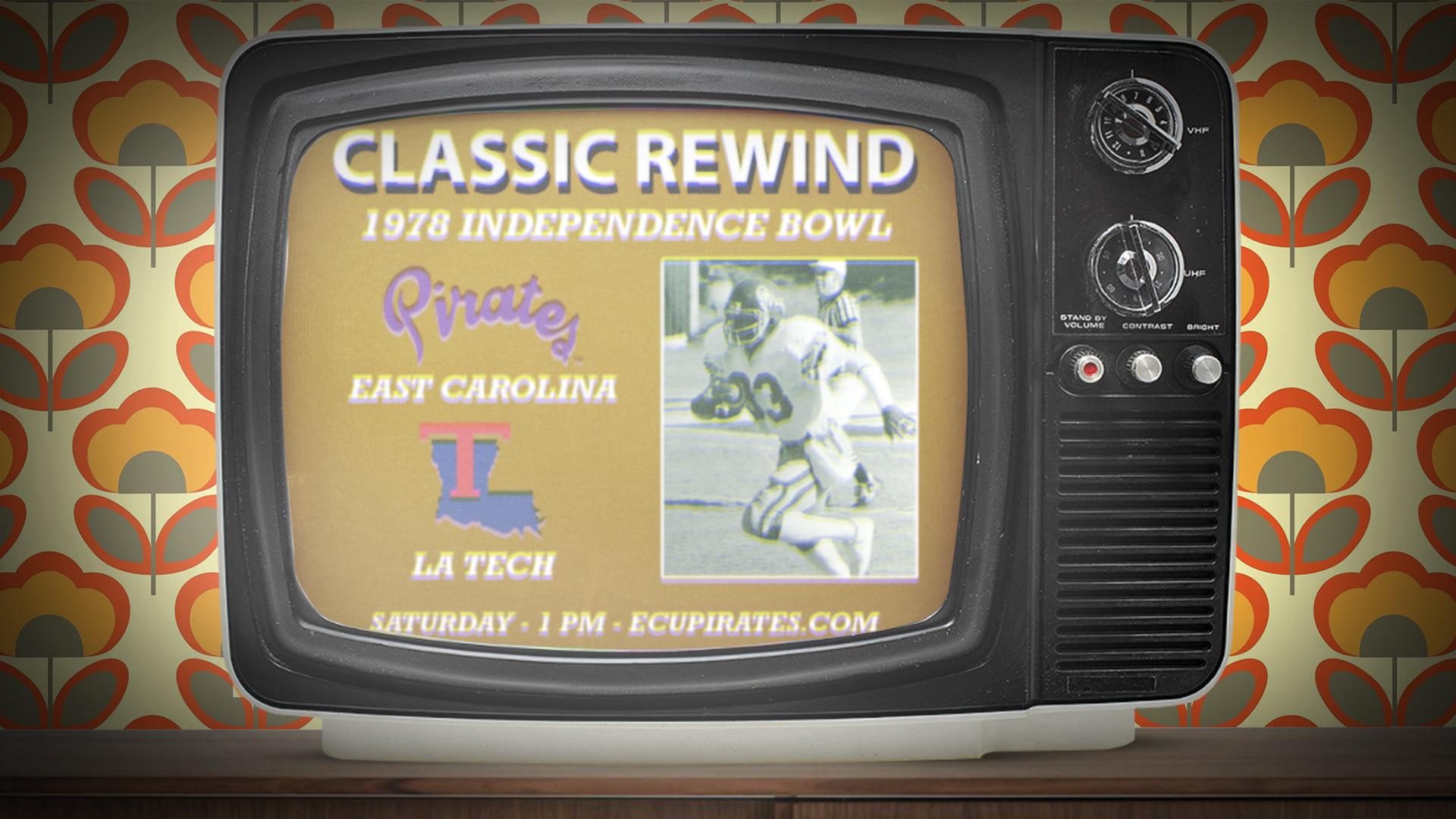
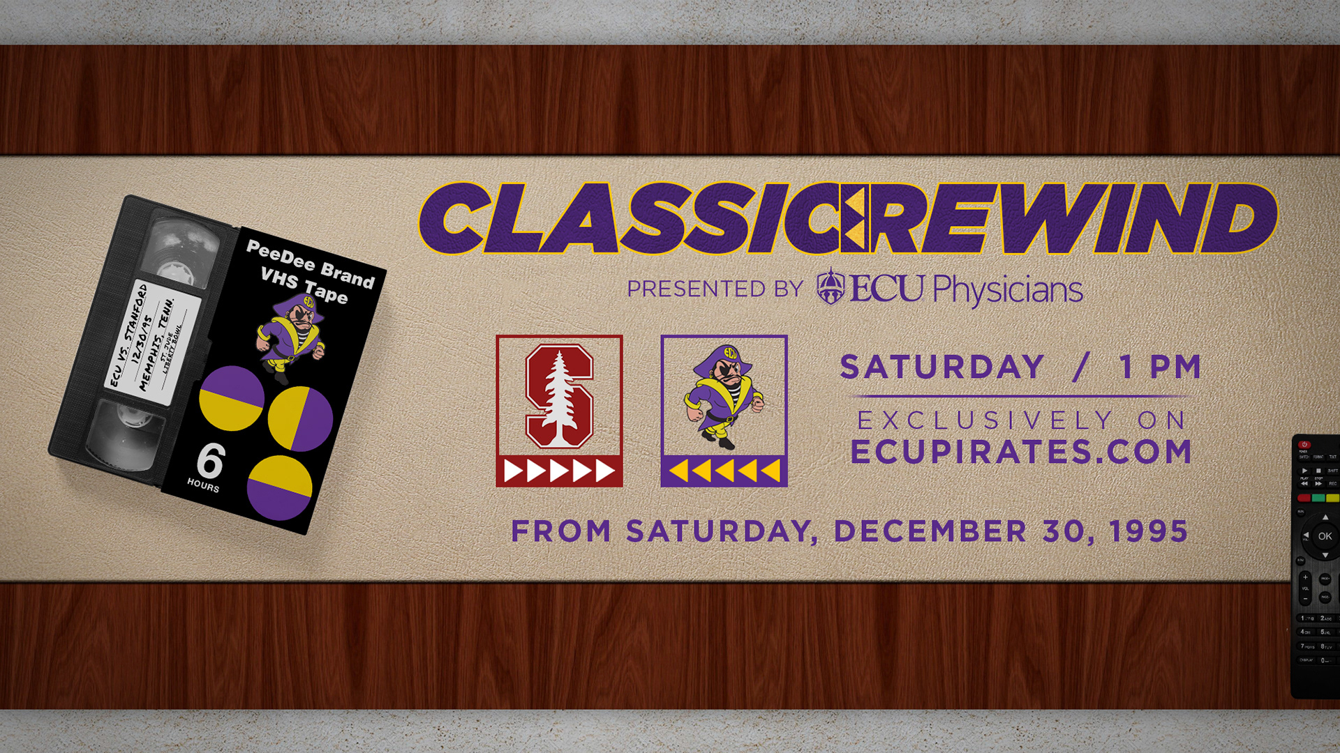
classic rewinds
To help with sponsor fulfillment, we decided to do a series of virtual watch parties while streaming classic ECU football games. For each contest, I made special promotion graphics and videos to promote the games leading up to the event each Saturday.

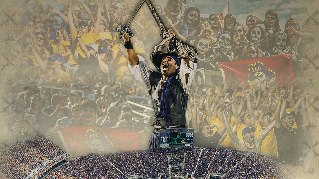
No quarter bumper
Toward the deadline for football season ticket renewal, we made a social media advertisement where our head football coach encouraged fans to fly their No Quarter flags from home during quarantine and share with our social media accounts. My role in the ad was to make a motion bumper to end the advertisement, which can be viewed below. Elements include a flag texture, our Adidas brand pattern and a sword sound effect.
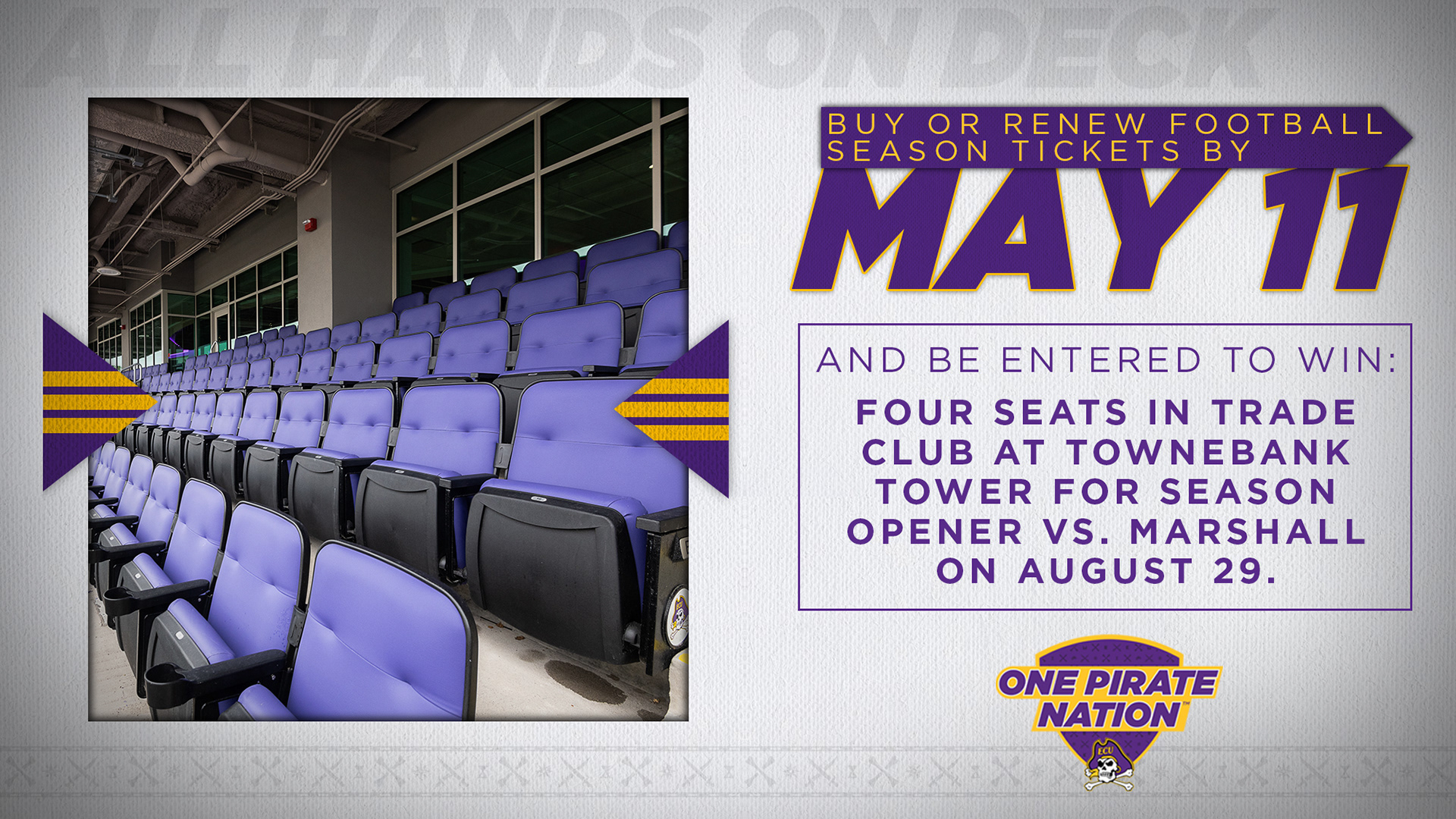
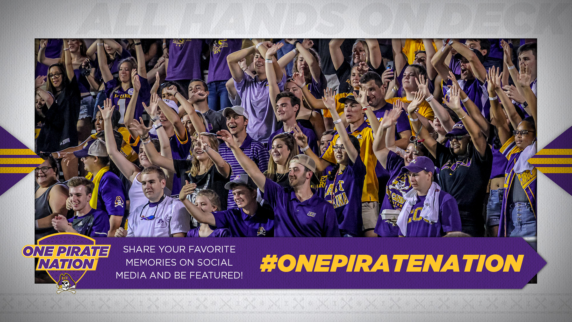
one pirate nation
To rebuild Pirate pride during a very challenging time, we launched our One Pirate Nation campaign around the deadline for football season tickets. For this, I wanted to use a lighter and warmer look since much of our campaign was built around development and fan-generated content. This also included the creation of a vector logo to use in branding the initiative as well, which you can learn more about here.